react toastify notification in react Complete Guide

React Toastify is a popular library in the React ecosystem designed to simplify the process of displaying notifications or toasts in web applications. Its purpose is to provide React developers with a straightforward and customizable solution for presenting temporary messages or alerts to users in a subtle manner.
The primary goal of React Toastify is to push the user experience by offering a visually appealing and understated way to communicate important information such as success messages, error notifications or warnings. It allows developers to quickly integrate notification functionality into their React applications without having to build it from scratch.
One of the main advantages of using React Toastify is its ease of use and flexibility. Developers can easily create and customize toast notifications according to their application’s design and branding requirements. The library offers various configuration options such as including duration, position, animation effects and appearance that allowing developers to design the notifications to suit their specific needs.
Furthermore React Toastify is actively maintained and has a vibrant community which means developers can expect timely updates, bug fixes and ongoing support. This helps guarantee the reliability and stability of the library that making it a dependable choice for integrating toast notifications into React projects.
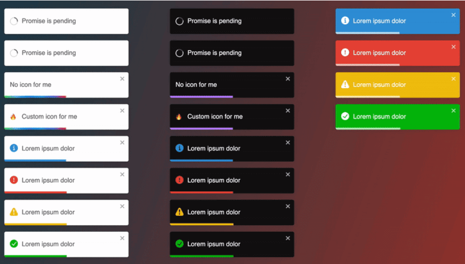
Table of Contents
let’s make User-friendly Notifications with React Toastify
If you want to make your React project look cooler with nice pop-up notifications that you can easily customize. This guide is perfect for beginners. in this guide we will show step by step how to add React Toastify to your project. We will start with how to install react toastify ? and then move on to the basics of using it and finally we will cover how you can tweak it to fit your needs. Let’s get started!
install react toastify in project with NPM
You can easily do this using npm or yarn. Open your terminal and run one of the following commands:
Using NPM
npm install react-toastifyUsing YARN
yarn add react-toastifyOnce React Toastify is installed now you are ready to start using it in your project. Here’s a basic example of how to display a toast notification:
import React from 'react';
import { ToastContainer, toast } from 'react-toastify';
import 'react-toastify/dist/ReactToastify.css';

function MyApp() {
  const notify = () => toast.success('Hello, world!');

  return (
    <div>
      <button onClick={notify}>Show Notification</button>
      <ToastContainer />
    </div>
  );
}

export default MyApp;
In this example we import the ToastContainer and toast components from react-toastify. then we define a function notify that triggers a success notification when called. Finally we render a button that when clicked calls the notify function to show the notification.
Configuration Options for react toastify
- position : Set the position of the toast on the screen (e.g. top-left, top-center, top-right, bottom-left, bottom-center, bottom-right).
- autoClose : Specify the duration (in milliseconds) for which the toast should remain visible before automatically closing.
- hideProgressBar : Hide the progress bar that appears beneath the toast.
- pauseOnHover : Pause the auto-close timer when the user hovers over the toast.
You can pass these configuration options as props to the ToastContainer component. For example:
<ToastContainer position="bottom-right" autoClose={3000} hideProgressBar={true} pauseOnHover={false} />Customize Toast Notifications with React Toastify
Want to add a personal touch to your toast notifications in your React project ? With React Toastify it’s easier than you think. Let’s see how you can customize the appearance and behaviour of your toast notifications to better suit your application.
Change Colors in react toastify
One of the simplest ways to customize your toast notifications is by changing their colors. React-Toastify allows you to change background color, text color and even the color of the progress bar. when you want to match your brand color scheme or create visually appealing contrasts the choice is yours.
<ToastContainer
  bodyClassName="custom-toast"
  toastClassName="custom-toast"
/>
Adding Icons in React toastify
Adding icons to your notifications can make them clearer and more attractive. React Toastify makes it super simple to include icons in your notifications that giving users a visual hint of what’s happening. Whether it’s a checkmark to show success or a warning sign for errors. Icons can instantly communicate information to your users.
import { toast } from 'react-toastify';
import 'react-toastify/dist/ReactToastify.css';
import { AiOutlineCheckCircle } from 'react-icons/ai';

toast.success(<AiOutlineCheckCircle />, {
  bodyClassName: 'custom-toast',
  toastClassName: 'custom-toast',
});
Customizing Animations in react toastify
Animations can make your notifications feel more dynamic and engaging. React-Toastify offers various animation options out of the box that allowing you to choose the one that best fits your application style. Whether you prefer a subtle fade-in or a playful bounce effect.
<ToastContainer
  transition={Slide}
  position="bottom-right"
  autoClose={5000}
  hideProgressBar={false}
  newestOnTop={false}
  closeOnClick
  rtl={false}
  pauseOnFocusLoss
  draggable
  pauseOnHover
/>
Handling Different Types of Notifications with React Toastify
In web application React-Toastify makes it simple to handle various notification types such as success messages, error alerts, warning messages and informational notices.
Success Message
import { toast } from 'react-toastify';
import 'react-toastify/dist/ReactToastify.css';

const handleSuccess = () => {
  toast.success('Your task was completed successfully!');
};
Error Alerts
import { toast } from 'react-toastify';
import 'react-toastify/dist/ReactToastify.css';

const handleError = () => {
  toast.error('An error occurred. Please try again later.');
};
Warning Messages
import { toast } from 'react-toastify';
import 'react-toastify/dist/ReactToastify.css';

const handleWarning = () => {
  toast.warning('Proceed with caution. This action cannot be undone.');
};
Informational Notices
import { toast } from 'react-toastify';
import 'react-toastify/dist/ReactToastify.css';

const handleInfo = () => {
  toast.info('Check out our latest blog post for more information.');
};
Advanced Usage and Best Practices with React Toastify
React-Toastify offers more than just basic notification functionality. Let’s explore into some advanced features and best practices to maximise its potential in your React applications.
Using Custom Components
React-Toastify offers a handy feature that make ability to use custom components within toast notifications. This means you can design notifications that fit your app perfectly. Imagine including buttons, links or even forms right in the notification itself. It’s a powerful way to create personalised and interactive alerts that suit your application requirements.
import { toast } from 'react-toastify';
import 'react-toastify/dist/ReactToastify.css';
import CustomComponent from './CustomComponent';

const handleCustomNotification = () => {
  toast(<CustomComponent />, {
    position: toast.POSITION.TOP_CENTER,
    autoClose: 5000,
  });
};
Implementing Best Practices
- Keep Notifications Concise : Keep your notifications short and to the point to make sure it’s easily digestible for users.
- Use Toast IDs : Assign unique IDs to your toast notifications to manage them more effectively such as updating or removing specific notifications.
- Limit Concurrent Notifications : Avoid overwhelming users with too many simultaneous notifications by limiting the number of notifications displayed at once.
- Test for Accessibility : Make sure your notifications are accessible to all users. Including those using assistive technologies like screen readers by testing for accessibility compliance.
conclusion
React Toastify proves to be a valuable asset for React developers seeking to enrich user experience through streamlined and customizable notification systems. Its simplicity, flexibility and ease of integration make it a standout choice for displaying temporary messages or alerts in web applications. By following the provided guide developers can effortlessly incorporate React-Toastify into their projects. From installation and basic usage to advanced customization and best practices. With Reac- Toastify creating user-friendly notifications that seamlessly blend with your application design and functionality is within reach and empowering you to deliver a polished and engaging user experience.
Click Here to find More Detailed guide about ReactJS
FAQs
Can I customize the appearance of toast notifications with React Toastify?
Yes, React-Toastify offers various customization options such as changing colors, adding icons, customizing animations and more. You can make the appearance of toast notifications to match your application’s design and branding.
Can I use React-Toastify in server-side rendered (SSR) applications ?
Yes, React-Toastify supports server-side rendering (SSR) that allowing you to use toast notifications in SSR applications seamlessly. You can render toast notifications on both the client and server sides to provide a consistent user experience.


One Comment
Comments are closed.